Wed 28 Mar 2007
Train Wreck
Posted by anaglyph under Bad Sydney Art
[15] Comments

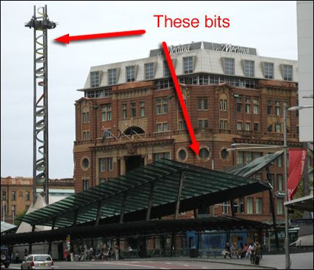
The next stop on our Bad Public Art Tour of Sydney takes in a combination of art and architecture, the sum of which truly amounts to a greater travesty than its parts. Feel free to aim your cameras at the 1999 makeover of Sydney’s major bus and rail interchange Railway Square.
The overall cost for this unmitigated disaster is variously quoted as $12 million or $20 million dollars. Either way it is money that could have been spent a lot better.
The government architects that won the tender for the job (let me guess – they were the cheapest…) have managed to effortlessly combine complete lack of utility with ugliness. This is no mean feat. (It’s not unusual to see one or the other – pretty but useless, or useful but hideous – but to manage both simultaneously takes a particular level of ineptness).
If you scrutinize the image above, you will immediately see one of the first problems you might encounter as a commuter seeking shelter under the bus shelter. Yes, that’s right. There is none. Even the mildest amount of rain manages to swish its way under the stupidly swept-up roofs of the thing, and if there’s any serious rain and/or wind, the elements are focussed in such a manner that you’d probably be better off standing on an unsheltered street. I speak from experience.
At the opening of the building, the government architect Chris Johnson ((Elsewhere the architecture is credited as “conceived by DPWS architect Margaret Petrykowski”. No-one is very happy to take responsibility for this mess.)) was questioned by a reporter about the lack of effectiveness of the shelter in inclement weather. He replied, bafflingly:
“During a strong southerly wind, there may be a problem with rain. But people have to walk through the rain from the home.”
Er… yes, Mr Johnson, so what you’re saying is, er, that since they’re already wet, then it doesn’t matter that the shelter is crap?
In the Hansard extract where that snippet of peculiar reasoning appears, The Hon. E. M. Obeid on behalf of the Minister for Public Works and Services declares:
“The weight of opinion is that this has been an excellent result, which has dramatically improved both the flow of buses and the amenity and facilities for commuters.”
Which begs the question: The weight of whose opinion, exactly? I’m thinking it’s not going to be the soggy people waiting in the wind-tunnel for their 20-minute-late bus.
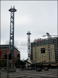
Now if you’ll just follow me this way, I’ll ask you to turn your attention to the next feature of this work – the lighting towers. I use the word ‘lighting’ parenthetically. I don’t think I’ve ever actually seen the lights working. I know they must have at some time or other, because there are pictures of them illuminated. Most times I go past at night, however, they are just big dark gloomy junk-metal towers. The thought invariably comes into my mind that they will look exactly appropriate when the apocalypse comes.


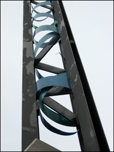
Aside from their lack of luminance, the other great feature of these radio-tower maquettes is the great shreds of coiled metal that spiral down their insides. It reminds me of nothing so much as a gargantuan replica of the mess you get if you tear up an aluminium soft-drink can.
The overall effect of the Railway Square edifice is one of complete industrial chaos. It’s as if someone rifled through a gigantic mechanical scrap heap and then dumped the lot in a pile. There is no thought of harmony at all, either within the creation itself, or with the surrounding environment.
To make matters worse, the structures are looking very shabby indeed now. The paint on the towers is peeling off, and the glass on the shelters is dirty and covered in bird shit. I don’t believe it has ever been cleaned. It’s not the way you’d expect to see something treated if you were proud of it.
Back in 1999, The Minister finished off his defense of the interchange revamp in parliament by opining through Mr Obeid:
“It is a clean and modern facility and one that, as time passes, will become accepted as not only an important transport interchange, but as a new gateway to the city.”
Well, Minister, time has indeed passed and I think that most of my fellow citizens and commuters would agree with me that after 8 years of practical interaction with this incarnation of Railway Square, it is not looked upon by us with even the remotest degree of fondness, and certainly not accepted as any ‘gateway to the city’. It is, at best, just barely tolerated.


Many a time I’ve waited for the bus there wondering “why the flugelhorn did they design it like this?”. Good post on a baffling part of a Sydneysiders daily life.
how are you tearing up soft drink cans reverend? with your bare hands? maybe that’s how you got your stigmata…?
I get super-human rage strength whenever I hear Alexander Downer speak.
Have you got an opinion on Duchamp’s “Fountain”? I feel the same about that as you do about this.
Except that Duchamp made ‘Fountain’ in full knowledge of what he was doing. He was a Dadaist. It was an attempt to shock, to jolt, to challenge, to amuse. He was making fun of the established paradigm and attempting to get viewers to understand the paradox of what makes something art. Duchamp was a genius.
That kind of art has value. The kind of ‘art’ on my tour has no redeeming features.
When the edifice was first erected, there were no rubbish bins. Perhaps this was to deter the street folk who had theretofore found good pickings at Railway Square. Or perhaps They forgot to put bins. There were also no benches. You know, to sit on while you are waitng for a bus. Maybe They forgot those too. Now there are a couple of benches – oddly cold, smooth metal benches. And some bum-level horizontal metal poles. I’ve tried to perch on the poles, but it’s a struggle not to slip off – you must press back mightily with your legs. In short it’s horrid and, as Anaglyph says, doesn’t even do the practical things it was built to do.
Yes, there was a completely unacknowledged attempt to keep homeless people from sleeping in the shelter (as they used to before). The slidey metal benches and poles were definitely installed partially for that reason.
It’s certainly worked – the place is so forbidding and unpleasant that absolutely no-one wants to spend any time there. If they could get the public transport to be efficient, I guess no-one would.
Welcome to the Gateway to the City!
Chris Johnson + Obeid (NSW ALP Right Person of Influence – not what democracy needs) defending something that is neither functional nor attractive………kinda like government in NSW and Australia.
No form or function.
Yet another piece of public art seems that resembles a space alien communication device. I think you people should be worried.
“the paradox of what makes something art”: the hell d’ya mean by that? Is art defined by a paradox now or is that only in Sydney?And pray tell what is that paradox? Fountain was a piss take; a tilt at authority and the selection process of what was and wasn’t acceptable for exhibition. But call Duchamp a genius? What did he do to change the way we look at things in galleries that the Impressionists hadn’t achieved forty years before him?
And whathesamhill did ya mean by this too: “That kind of art has value”.What kinda art is this;the valuable kind? What kinds of art are there? What is the value of Art? More importantly,who defines that value?
Duchamp knew.
Looks to me like the architect(s) were drinking a wee bit too much of that Foster’s.
The worst part is that there’s some decent neighborhood architecture to que off of and contrast with. All these nice old buildings and then a junk pile. With phallic junk.
I’d say that the real problem with the shelter is that there is apparently no way to get a good angle to shoot it by itself. It looks like an attempt to echo the symphony hall. Bad public art makes great posts and essays; sometimes it is a bore (we have a couple of those here in AZ) but can be fun. However bad public works are a real pain for the taxpayers and especially the users and your shelter looks like a real winner in that category.
And don’t you just love the bullshit government newsspeak in that PDF you link to? The four towers represent the four elements huh? That’s the first I’ve heard of it.
Bad architecture is so lazy and so obviously the result of cheapness and committee decision-making. I come across the same attitudes every day with graphic design – only most of the time, thank god, it doesn’t affect people’s lives quite so badly.
Nada: And like the government in Australia, Railway Square succeeds only in making people unhappy, uncomfortable and irritable.
Phoebe Fay: Now that you point it out…
Wolfman: The concept of what makes people consider something ‘art’ or not is inherently paradoxical. Art is not defined by paradox, nor indeed by any concept you care to name, but only by whether it is deemed to be art by some kind of consensus. Whatever that turns out to be.
Duchamp is considerably different from the Impressionists in many senses – for a start they were pretty much exclusively painters. Duchamp experimented widely across all physical media and pushed into philosophical realms that the Impressionists weren’t concerned with. He didn’t confine his work to galleries either. ‘Fountain’ was indeed all those things you said. And remains that. To see it any other way is in contravention to what Duchamp intended. You’re not viewing the ‘thing’ when you view that work, you’re viewing the intent. Otherwise it simply is not arresting in any manner, but boring. I stand by my contention that he was a genius.
The ‘That kind of art has value’ statement was sloppy and hasty shorthand on my part, fair enough, but it’s a long, boring semantic argument about what is or is not ‘art’ and what is or is not ‘valuable’. For the purposes of discussion I think it is reasonable to assert that there are some efforts that attempt to be artistic statements in a general sense, that fail.
Catalyst: Or not enough.
Casey: Indeed. Although if you look at the building behind the shelter in the first picture, you can see another ghastly horror – the ‘hat’ that the Medina saw fit to plonk on the old Railway Institute building. Go on Wolfman – tell me that’s art.
GrannyJ: You’re right about the angle – almost impossible to get a fix on that building no matter how you look at it. And it’s worse in real life.
Universal Head: Yes – the towers represent the four elements. Huh? But why? What’s that got to do with anything? It’s that kind of dumb pseudo-intellectual claptrap that people fire off to get grants.
Nurse Myra: I already told you that I just noticed the stigmata. It just appeared. I have no idea where it came from…
Sirdar: The architect doesn’t think that stopping the rain is an issue. This is far worse than the mere design flaw itself.