Thu 6 Sep 2007
Red Poles
Posted by anaglyph under Bad Sydney Art
[16] Comments
Well Acowlytes, this is likely to be our last stop on the Bad Public Art Tour of Sydney, not because I’ve even come close to running out of Bad Art, but because, as I mentioned last post, I’m about to wave goodbye to The Harbour City and take up residence in The Paris of the South where the public art is of a different calibre altogether.
Today we head out west of Sydney toward the Blue Mountains. Have your cameras at the ready, because we’re on the freeway and will be (thankfully) passing this lame effort at speed.

I used to drive past these red poles on my weekly trips to the Treehouse. For months I’d sail on by thinking ‘When are they going to finish those damn things?’.
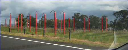
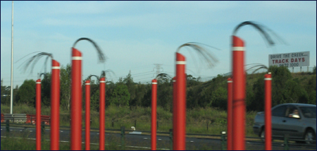
The poles, painted in garish Road Safety Orange with wires sticking out the top, were obviously some kind of lighting fixtures awaiting a tardy electrician to turn up and complete the job. One day as I sped past the thought entered my head that… ‘Oooooo… they are finished. It’s some kind of artwork!’
And then, chuckling to myself at my silliness… ‘N-o-o-o-o… that couldn’t be right…’
But it was. This is the Light Horse Interchange Sculpture Parade and those poles that look so much like a bunch of safety barricades on a bad hair day are in fact supposed to be symbolic of the horses and men of the Australian Light Horse regiments that served in France and The Middle East in the First World War.
This is how the effort is described on the Westlink M7 website:
Red, the colour of the Flanders poppy and poppies that bloomed throughout Palestine, is symbolic of the blood of supreme sacrifice and is the colour chosen for the sculptural group. The abstract plumage attached to each marker represents the emu plumes attached to the Light Horsemen’s slouch hats. The white band is a reference to the departing soldiers’ innocence of war.
Got that? Let me just rephrase it to clarify:
Crap. Crap. Crap crap crap crap crap crap crap crap crap crap crap crap crap crap crap crap crap crap crap crap crap crap crap crap crap crap crap crap. Crap.
First of all, the colour of the poles is not like any kind of blood I’ve ever seen, though at a stretch I guess you could say there are poppies that colour. Orange poppies. Secondly, the sculptor, whose identity I cannot find anywhere on the web (for obvious reasons, one has to speculate…) has evidently never seen an emu feather because they don’t look anything like bits of electrical wire. And aside from anything at else, the whole effect is just so completely pathetic. There’s no feeling of skill, or deliberation, or elegance, or challenge, or illumination, nor indeed any measure of art at all.

I have a terrible sinking feeling, in fact, that there was no actual decent artist within cooee of this project, but that the bunch that designed the freeway – engineers from the Urban Planning Department of the Roads and Traffic Authority and urban design company Conybeare Morrison – appended a quick sketch for the ‘sculpture’ to the bottom of one of their blueprints for the engineering of the overpass construction.
It would help explain the appalling ‘artistic’ statement that I quoted above. It certainly wasn’t penned by anyone with artistic thoughtfulness because it’s so awful.
In a review in Architecture Australia, General Manager of the New South Wales Government Architects Office, Peter Mould, says of the work:
This is a strong theme for public art, but its execution is disappointing. It is artwork seen in passing, at speed, and calls for a robust scale so that the rhythm of the parade is legible. The feathers, too, are unconvincing.
And that, for me, says it all. It doesn’t even meet the standards of a Government architect.
___________________________________________________________________________
Thanks Alicia for Pic#1 and Violet Towne for Pic#2
___________________________________________________________________________


They represent your dying car. You need to take it to the repair shop and get it keelhauled
I thought they were straws and it was an artistic homage to the Teletubbies.
I feel like such a loser.
I much prefer the “art” advertising the track days at Eastern Creek myself. But that’s just me. ;)
I think they look like bumper car poles. And the bumper cars are buried underground. Representing the burial of our childhood selves and all the barbaric joy associated with smashing into one’s friends. And now, I have a strange urge for funnel cake.
Maybe that aint spposta BE art, Revrend.
Maybe its only spposta represent art.
I thought it was a bunch of dead broom handles.
Anything of described as “the paris of the …..” really grinds my gears. Shame on you rev!
Melbourne is very nice though!
Malach: Oh, I dunno. I like those cute little barnacles that live in the exhaust manifold.
Colonel: Well at least the colours are more appropriate for kiddie television. Or construction sites. Time for Tubby Bye Byes!
Sephyroth: Well, it is true that art has a grand tradition of featuring naked women. The addition of same certainly couldn’t hurt the Light Horse Interchange Mediocrity.
Phoebe Fay: Unfortunately they didn’t bury them deep enough.
Joey: Aha! I tracked down the artist, Jackson Polack, and that’s exactly what he said.
Meggie: That would have been cheaper, I bet.
LoL: It seems to have escaped your attention that there is a level of irony in operation here on The Cow…
Irony? Really?
:-P
The poles are a cheaper version of those on the M7 that sails above it. There they actually interplanted them with trees so…..the trees will eventually mask them and you can see some kind of idea, though half-arsed, was there in the planning stage.
It was a landscape architectural style firm that did the deed. I loved driving past the poles as the workmen were installing them. There was much merriment…more so than when workmen normally work/stand among 8 lanes of 100kph.
I had hoped that to at least give it kitsch factor, the wire bits would light up at night – fibre optic style.
Truly, without doubt, the worst public ‘art’ I have seen anywhere in the world.
They look like sticks of TNT. Light one and see if you can rid the highway of this monstrosity.
Truly a shocker, and I can see why the work is not attributed to any artist. Getting worse with age too.
Someone needs to reinvent it.
Ny family passed this today, slowly in the afternoon traffic, and I thought I’d google to see if anyone else felt as abhorred as I do about these… things.
Hence I came across this post, and yes you do echo every thought I’d had when the M7 was being finished off and these stupid red poles appeared.
It’s been over 10 years now and they’re STILL there and looking sadder than ever. The M4 is getting something of an upgrade at the moment… is the time ripe for a campaign to re design the Light Horse Interchange Art-ish?
Maybe they could get an actual artist to do it this time.
I have moved away from Sydney so I haven’t seen them in a long while. It is definitely time for them to be moved on.