Fri 23 Nov 2012
Impressionism
Posted by anaglyph under Art, In The News, Science, Space, Stupidity
[12] Comments
The Australian Broadcasting Corporation’s science news pages are currently carrying a story about the discovery of a ‘rogue’ planet ((Is it just me, or does the term ‘rogue planet’ automatically conjure for anyone else Wagnerian-type music and sinister intentions? I mean, it’s not like it set out to storm the universe and take no prisoners. Why is it not simply an ‘orphan’ planet, or a ‘lost’ planet? What’s actually rogue about it?)) ‘wandering all alone through deep space without a host star’. As far as such stories go, it’s an interesting astronomy tidbit, evoking, in the words of Philippe Delorme from France’s Institute of Planetology and Astrophysics, a ‘striking image of orphaned worlds, drifting in the emptiness of space’.
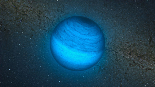
The editors of the ABC science pages ((Along with just about every other outlet carrying the story…)), however, have taken the view that readers will not have the wits nor imagination to be able to conjure up the striking image for themselves, and so have helpfully provided an artist’s impression to help them along. ((It is worth noting here that when the story first went up, the image was presented without the explanatory caption.))

I am not a big fan of the artist’s impression.
How much does this ‘impression’ tell you about the reality of the event in question? Would you say that it’s reasonable to expect that, should you be able to hop in a fast spaceship and fly off to planet CFBDSIR2149 (as it is catchily named), this artist’s impression would give you a vague idea of what you might see? This romantic milky sapphire marble swimming in a luminous sea of misty cerulean stars? Well, my friends, you’d be mightily disappointed. CFBDSIR2149 does not orbit any sun, and so does not reflect any light. In addition, it does not emit much, if any, visible light of its own either, being detected as it was by M. Delorme, via infrared radiation. The Wikipedia entry on CFBDSIR2149 has this to say:
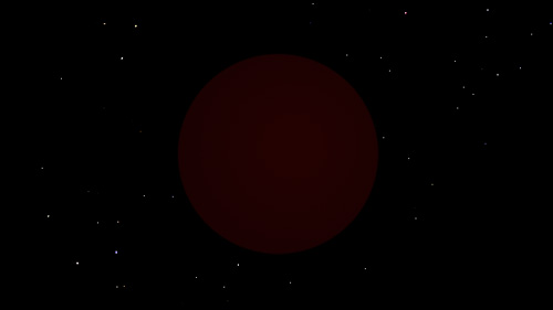
In visible light the object is so cool that it would only shine dimly with a deep red colour when seen close-up.
All things considered, here is a better artist’s impression of what you might see should you ever be in the close proximity of CFBDSIR2149.

Yep. It’s never going to feature on the ’10 Most Visually Impressive Planets You Must Visit Before You Die’ list, that’s for sure.
So what use, actually, is this artist’s impression? It tells us nothing at all about the reality of CFBDSIR2149, ((C’mon! Astronomers! Where are the days of imagination when planets had names? Are we to expect that if you were doing the solar system anew we’d be living on 3 and sending little rovers off to 4? How BORING is that?)) substituting actual facts with a whole lot of visual speculation and even just plain old untruths. Why not paint a picture of the Death Star or a Borg Cube – ‘impressionistically’ speaking, either would be just as informative. Worse still, whatever mental image we might have formed of a darkened planetary body drifting forlornly across the unimaginable dark nothingness of the interstellar void is now indelibly replaced by the fantasy of an azure Xmas bauble that has no relation to anything.
Here is an artist’s impression of what I believe should be the fate of editors who indulge in artist’s impressions. ((Yes, I am aware of the recursive nature of what I did there.))


My first thought was that it must have been pretty damn’ dim if it has no star, in which case, how did they “see” it
If you really must have a pretty picture…recycle an early, fuzzy image of Mars..that blue thing looks more like Earth.
Come back, Gustav Holst!
They were searching for low energy IR emitted by cool stars (brown dwarfs). Since CFBDSIR2149 is actually emitting some trace heat, it showed up on the search. There is speculation from some quarters that it is a brown dwarf, but the data is good that it has a methane atmosphere, so it’s either a large planet, or a star that’s behaving unlike any other star we’ve seen to date. The thing is, this IS interesting science, and the stupid picture trivializes the whole story.
LOL
I thought a “rogue” planet would look like this:
https://si0.twimg.com/profile_images/1078237421/emoticon-pirate-segment_normal.jpg
Poor ABC – a maverick planet looking like a frilly Uranus?
That’s certainly as valid an artist’s impression as the one they used, anyway.
Typical journalistic schtick. A headline in our local rag, reporting a plane crash. “DEATH PLUNGE!” Must have been a slow day. “HIGHWAY OF DEATH!!” to describe a 3 car accident with fatalities. Saw one in an american rag about a robbery. (Pre-election) “Daring daylight robbery, 3 blocks from Obama’s mothers house!”
I figure you could find a ‘daring daylight robbery’ three blocks from almost anywhere you cared to mention if you really wanted to.
Also, just in case you missed ’em, we have visited those brainless ‘news-speak’ terms previously on The Cow, here and here.
Yes artists are generally not great when it comes to details of the business. Some even have difficulty with reality in most shapes and sizes.
The “commonsense” approach – even with the very best of science short of direct observation, they will for the most part be wrong. Perhaps it’s enough to just get theoretical predictions of behaviour and influence and the like. Most pedestrian geniuses probably stick with that for a start. Or you could come over all daVinci (or Goya) and try predicting what a Higgs boson would actually “look like”.
But the commonsense view of the most well directed artists’ impression also serves to limit and restrict us. It is a reflection of seeing new things with old eyes.
Like putting oak leaves the eucalypts on early Australian etchings. A little nostalgic attachment to “building on what we know” and our comforting assumptions… an anchor.
Like the notion that atoms look (and operate) like some cute little Newtownian solar system. Of course the reality ends up being a whirling jumble of possibilities and likelihoods…statistics in space and time … more a jumble of smudges in pretty patterns than a set of billiard balls.
Now which would have been a much more interesting picture? For mine, had the artist been given rein to go seriously abstract – like the actual thingy in question we would have got something more truthish. More Jackson Pollock than Newton. Or Newton on acid perhaps?
Who knew that Hubble would show us something more akin to pond water on a galactic scale and curiously organic structures on a massive scale? And how big BIG really is. A bit.
Well beyond our Ken this inspired guesswork – at least those of us with the slightest hint of commonsense. Especially the great scientists. Einstein knew that – we are only limited by the powers to imagine.
So get your pimply nerdy facts and assumptions out of our imaginations you sensible scientists with your extrapolated understandings.
Less science more psychosis!!!
In the case of something like this, it’s probably not the artist who is to blame, so much as the person who told the artist what to do an ‘impression’ of. My gripe is more about the daft need to put a picture with this story in order to somehow ‘trick’ it up, than with artists and their imaginings (lawks, I’m an imagining artist of scientific things myself).
The fact is, this picture holds no useful information. There is absolutely ZERO chance that CFBDSIR2149 looks like the ‘impression’ in any meaningful sense. To put it another way, an interpretive dance routine of CFBDSIR2149 would be just as informative.
This post involves a similar artist’s concept of a ‘diamond star’ that just makes me want to laugh. What does the picture even mean? It’s a completely useless frivolity.
Indeed, as you say, if we want artist’s ‘impressions’ of scientific things, let’s just let them do whatever they want to interpret stuff- at the very least it would be an honest undertaking.
If it wasn’t for the Coca Cola company, children worldwide would never have known that Santa wears a red suit with white fur trim… and we all know that ‘Coke’ is the ‘real thing’ (they told us that too).
If it wasn’t for the the ‘artist’s impression’, how many more dangerous criminals would still be on the run from ‘the law’…
I loved the ‘artist’s impression’ in 2012 (the movie) of the ‘end of the world as we know it’ too, I would have been standing right next to Woody Harrelson yelling woohoo (Blink 182)…
We need both the ‘artists’ impressions’ and the mundane (more accurate) version, to inspire interest in the ‘less interested’, and to inspire discussion amongst those interested in what it might look like viewed in a different light spectrum and how it’s surface features might appear or have been formed, how it acquired it’s ‘spin’ (oops, I digress :), but most of all to inspire the author of this blog to put ‘digit to key’ which in turn incurred the wrathful ‘critique’ of the ‘angry man’…
Was the whole thing a conspiracy by the blogger in the first place? I think not.
I think our ‘Rev’ had something ‘stuck in his craw’ that he had to rid himself of, but hey, it turned into something else, it turned into an amusing couple of hours of ‘light exercise’ for my brain.
Thanks dude, now where was I…
Please disregard grammar, spelling errors or ‘improper use’ of apostraphes (I did :)
BTW, my ‘pic’ is an ‘artist’s impression’ of me…
You’ve somewhat failed to get my point. Most of the impressions you’ve quoted above are artistic speculations in ‘artistic’ contexts. There’s nothing wrong with that at all, and as I said in the reply before your comment, I spent four years on project that is exactly that.
The example you gave of ‘catching criminals – I guess you’re talking about police sketch artists – is a different matter entirely. That’s a case of a person – more an interpreter than an artist – attempting to provide the most accurate visual description possible in order to fulfill a useful technical function. The last thing you want in a police sketch of a wanted criminal is artistic interpretation (in fact, I can visualize an excellent comedy sketch based on that notion).
When you say that the image to which I’m taking exception is useful:
…etc, you’re speaking to my point. This is what I object to. I don’t think the picture is in any way useful in determining what the planet looks like in a different spectrum because it is simply a wild guess. I could pull seventeen different such speculations out of a hat, and every one of them would be no more or no less accurate than the one provided. The same with surface features – the ‘artist’s impression’ is simply a riff on planets in our own solar system, and we have no reason at all to speculate that this orphan world would look anything like these. In fact, considering it is a planet quite unlike anything we have seen before (orbiting no star, inhabiting no system with other planets), there’s an imperative to suggest it might be considerably different to planets we have seen.
The artist’s impression, however, immediately slams it into a pigeonhole. The speculative image has not enabled imagination, it has limited it. Unlike the case of the police sketch, the premise behind this kind of image is not to provide information. It’s merely there as a ‘pretty picture’.
Don’t misunderstand what I’m saying here – speculative scientific imagery can be very useful. It’s just that when it’s concocted to make stories more easily digestible by the general public, it’s seldom anything other than eye candy.