Sun 1 Mar 2009
Discolour My World
Posted by anaglyph under DIY, Ephemera, Hmmm..., Ooky
[37] Comments
As you know from recent tales, Violet Towne and I are having our house painted. Now that our home is slowly being illuminated in refreshing shades of clean brightness, we’re beginning to truly appreciate the awfulness of the colours that we’ve been living with up till now.
Take the former colour of the walls of our bedroom. Really, I find it hard to describe to you the true repulsiveness of the hue to which the the previous owners had chosen to awaken each morning. In fact, to my mind it was something that belonged less in the class of pigment than it did in the category of stain, being as it was a shade reminiscent of the flesh of three week-old dead salmon.
What kind of decision process must someone go through to choose a truly hideous colour for the decoration of their place of habitation? Where do they even find the paint to render their walls in such nauseous squalor; colours that certainly never appear on any paint chart I’ve ever seen?
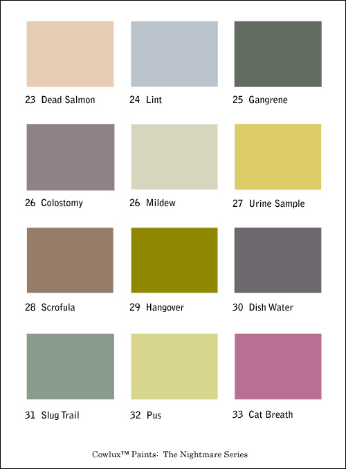
Pondering these questions leads me to suspect that there is a whole class of paint swatches unavailable to People of Taste. Something kept out of sight under the counter with the pebblecrete brochures and garden gnome catalogues. A dog-eared little booklet that remains safely tucked away until a customer with the just the right damp-palmed, sweat-stained, combed-over demeanour enters the shop.
Something with pages that look like this:


Thanks very much. Can’t wait for the ‘Feeling the Ceiling’ series: 68 Unease, 69 Mild Nausea, 70 Deep Ambivalence, 71 Now Where Did I Leave It? 72 Paper Cut
I’m surprised ‘White Powder Gold’ didn’t make it Rev.
I’d also like to see “Rasputin”.
The King
King: Rasputin only shows his ugly head on January 1st. And if he sees his shadow, we got another two weeks of winter. Or something like that.
Sounds a bit like Groundhog day, I’m sure the Rev felt a bit like that waking every day in his flesh coloured boudoir…
The King
The colours are great on their own but it is when you combine them that you really start to see the true effect.
The walls in my store, for instance, are a mix of colostomy and pus but the baseboard is nothing but urine. When combined, the effect is dizzying.
Great site, by the way. Really enjoying it. Though you might want to switch up the colour scheme…a little hangover and lint never killed anyone.
You painting it?
Malach, I’m speechless!
Ram makes a good point, the border colour here does look suspiciously like a mix of Cat Breath and Mildew with a few graphics thrown in Rev…
The King
And as for the centre shading it reminds me of a song:
A lighter shade of urine!
The King
Or is that “Nights in White Salmon”?
The King
In fact the graphic for ‘Ride the Mad Cow!’ is totally Slug Trail.
How long has Cowlux been going then Rev?
The King
Interesting, King Willy. I see The Cow as a mixture of Colostomy and Mildew (something I was blissfully unaware of until now.)
Um, worried about our new paint job in the bedroom. Can I see a swatch for “Rasputin”?
Problem is …
… I doubt Rasputin woud fit in a can.
I kind of like some of these colours. Which no doubt puts them in the category of what Pil would call ‘Gifford colours’.
Read this, suddenly hungry. Odd.
Married to a painter. Some of the jobs he has had to do go totally against his color palate ethics, but you do what you gotta do.
The color “hangover” is kinda growing on me, like mold.
You know, there might be a lot of truth to this. And if you combined the colors of number 27, number 32 and number 33, you could call it kidney cancer.
Cissy: Ah, ceilings. That’s another post entirely. The ceiling in our bedroom has been lovingly coated with a generous layer of grit. Well, that’s what it looks like anyway – you know the effect – like pebblecrete except with sand. At least now it’s a pleasant white shade of grit, which makes for a refreshing change from the former hue of Smoker’s Cough.
Joey: Yes, a valid point. Someone has got to be manufacturing the stuff, and the military is a good candidate. These colours are almost certainly developed by the psycho-warfare units.
King Willy: I suspect you need your monitor recalibrated. The Cow has a most pleasing colour scheme of Crème Brûlée and Lavender Fog.
Atlas: Rasputin isn’t so much of a colour as an entire decorating concept. We can arrange for a representative from Cow Interiors to advise you on the suitability of the Rasputin makeover by appointment.
Ram: I hope to have the privilege of enjoying the Food Here Store ambience when we deliver your first crate of Mnorgovudkka. In the meantime, to get the effect you’re after for viewing The Cow in NauseaVision, I suggest you take a leaf out of King Willy’s book, and rack up the saturation on your monitor.
Malach: And that comment makes any kind of vague sense how?
Pil: You might like to get your monitor calibrated also. As for your walls, well, it’s unlikely you’d achieve the Rasputin effect accidentally, unless you happen to have a barrel of eels and a rotary hoe handy.
Universal Head (and all): I’m afraid many of you have failed to get the drift of my post – it’s not that I have anything against many of these colours per se. In fact, I, too, quite like some of them. It’s the rendering of them onto the walls of rooms you spend your life in that is the problem. Just look at the chart again. Now, tell me you’d love to eat your breakfast in the early hours of the morning in a room painted with Urine Sample.
MI: All those colours are best thought of as some kind of mold.
Mike: Yeah, kinda like you combine flavours with Jelly Belly beans. Which are sort of kidney shaped, come to think of it.
I always thougt jelly bean was a flavor unto itself.
Have th flavor-chemists look into it, will ya?
Damn! I missed the drift of your post!
Joey: ‘Jelly Bean’ is a flavour like the ‘chicken’ in ‘chicken salt’ is a flavour. Or ‘barbecue’ is a flavour. It’s those flavour chemists pulling our strings.
Universal Head: Couldn’t keep the cornflakes down, eh?
PS We love your site Rev. Now get that damn SHARE popup away from the Comments button! Argh!
I didn’t even notice the share button until UH pointed it out. But he’s right. Having a little Windoze icon on your blog is like walking in on your parents having sex – as senior citizens.
Actually I’m whinging because I keep accidently rolling over the damn thing when I go to leave a comment, and it pops up – prompting me to cry “fuck off!”
prompting me to cry
Yes, the Cow has that effect on people.
I like the share button. It makes me feel vaguely connected to the youth of today (clicking on “More” made me feel a bit faint).
Actually I rather like the idea of a lone guy in his bedroom yelling “fuck off!”
Keep the button Rev, as Obi-Wan said “The Force has a strong effect on…etc”
The King
Share, Share, Share, Share, Share, Share, Share, Share, Share, Share, Share, Share, Share, Share, Share, Share, Share, Share, Share, Share, Share, Share, Share, Share, Share, Share, Share, Share, Share, Share, Share, Share, Share, Share, Share, Share, Share, Share, Share, Share, Share, Share, Share, Share, Share, Share, Share, Share, Share, Share, Share, Share, Share, Share, Share, Share, Share, Share, Share, Share, Share, Share, Share, Share, Share, Share, Share, Share, Share, Share, Share, Share, Share, Share, Share, Share, Share, Share, Share, Share, Share, Share, Share, Share, Share, Share, Share, Share, Share, Share, Share, Share, Share, Share, Share, Share,
ps
Share, Share, Share, Share, Share, Share, Share, Share, Share, Share, Share, Share, Share, Share, Share, Share, Share, Share, Share, Share, Share, Share, Share, Share, Share, Share, Share, Share, Share, Share, Share, Share, Share, Share, Share, Share, Share, Share, Share, Share, Share, Share, Share, Share, Share, Share, Share, Share, Share, Share, Share, Share, Share, Share, Share, Share, Share, Share, Share, Share,
The King
Universal Head: >>Actually I’m whinging because I keep accidently rolling over the damn thing when I go to leave a comment, and it pops up – prompting me to cry “fuck off!â€
Maybe you need to practise your mouse skills, as well as improving your colour schemes.
All: For some time now there have been two links to Comments on every post – one at the head and one at the tail. If the mouseover on the ‘Add This’ button offends your sensibilities, use the other link…
Who’s Al?
Is that you Malach?
HAHAHAHAHA!!!!! Sure, insult me after I send you your package! Fucker! HAHAHAHA!!!
And I thought you cared about your readers Rev. I’m shattered …
Oh, I do, I do. But I also feel I have a fatherly responsibility to improve their life skills, including dexterity and 21st Century social integration.
Institution Cream plus Blued Puce….hmmmnn
Blechh
“Off” white is the colour that does my head in.
Significant family member and I (ok, my mother) have NEVER agreed on style. Her love of off white walls is porridge to my bacon and eggs. I thrive off colour and movement. She likes bland with “accents” ..
So I’m painting the shit out of her off white flat haha