Sat 6 Aug 2005
Art for Eat’s Sake
Posted by anaglyph under Art, Food & Drink, Laughs, Signs
[9] Comments

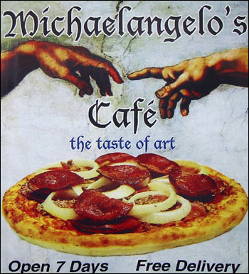
This flyer from my letterbox today.
Oh dear. Where does one start? The Ye Olde English font? (Oh, you know, it’s way back whenever, when writing was, like, all flowery an’ that…) The most unappealing image of a pizza you could possibly make (the onion still looks raw for crying out loud)? The fact that one of the most moving images in the history of human creation, the act of God and Adam poised reaching out to one another but not ever touching, is being used to sell pizza? (Maybe the idea is that God and Adam have just freshly tossed the salami and onions from on high?)
Or should we focus upon that little phrase, squeezed in almost as an afterthought: the taste of art?
Could it be that we are meant to infer that Michelangelo’s Café will create for you the Sistine Chapel Ceiling of pizzas? God help us all.
Perhaps I’m being unfair? Righty-ho, I will rise to the challenge and take it upon myself to personally assess the alleged magnificence of Michelangelo’s pizzas, with a dutiful and comprehensive report back here on The Cow in due course. That should keep everyone glued to my blog for a few days.
In the meantime, let us ponder the taste of art. I’m offering these suggestions for business opportunities for aspiring restaurateurs-cum-artists, along with tips for promotional material:
★Picasso’s (Tapas – flyer features ‘Guernica’ and a dish of paella)
★Pollock’s (Diner – flyer with ‘Blue Poles’ & plate of scrambled eggs)
★Degas’ (Creperie – flyer: ballet dancers & Crepes Suzette)
★Duchamp’s (Noodles – flyer: pic of a urinal & plate of sardines)
★Mondrian’s (Waffle House. No brainer…)
★Hirst’s (Steakhouse – cowhide flyer w. pic of jar of formaldehyde)
★Monet’s (Bagels – ‘Poppies’ + poppyseed bagel)
★Calder’s (Mobile Meal Delivery Service)
★Warhol’s Soup Kitchen…
Oh I tire. Over to you, dear readers…


Still, if they’re only open for seven days it seems like this problem will soon resolve itself. :P
What about a Dali’s restaurant? Incomprehensible menu artwork – entree associations.
mmm… urinals and sardines. my favorite!
Are you planning on having it delivered or going to the restaurant? I think you should go there and really soak in the ambiance.
That flyer is so bad that I would’ve thought it was a joke.
can I come? I always wanted to be “my companion had” in a restaurant review.
I’m pretty sure that God intended pizza to have cheese.
There’s actually a pretty good pizza/pasta chain in Cape Town called Da Vinci’s. No, they don’t have horrid “arty” flyers or logos, but they do have (a) crayons and newsprint tablecloths – best of the results are displayed on the walls; and (b) pizzas named after famous artists. The Degas, I recall, had smoked salmon, sour cream and caviar. Tasty.
There was this guy see.
He wasn’t very bright and he reached his adult life without ever having learned “the facts”.
Somehow, it gets to be his wedding day.
While he is walking down the isle, his father tugs his sleeve and says,
“Son, when you get to the hotel room…Call me”
Hours later he gets to the hotel room with his beautiful blushing bride and he calls his father,
“Dad, we are the hotel, what do I do?”
“O.K. Son, listen up, take off your clothes and get in the bed, then she should take off her clothes and get in the bed, if not help her. Then either way, ah, call me”
A few moments later…
“Dad we took off our clothes and we are in the bed, what do I do?”
O.K. Son, listen up. Move real close to her and she should move real close to you, and then… Ah, call me.”
A few moments later…
“DAD! WE TOOK OFF OUR CLOTHES, GOT IN THE BED AND MOVED REAL CLOSE, WHAT DO I DO???”
“O.K. Son, Listen up, this is the most important part. Stick the long part of your body into the place where she goes to the bathroom.”
A few moments later…
“Dad, I’ve got my foot in the toilet, what do I do?”
acarialew: Now see, we have this thing in conversations called ‘coherence’. This is when one person starts to talk about, say, their cat, and tells an amusing tale involving its exploits. Then someone says “Hey, that reminds me of the time my cat got stuck in a washing machine – I spent a fortune calling a plumber to get him out!” Then ensues a conversation about the expensiveness of tradesmen; renovations; how long they take; whether Sam’s will be finished by Christmas; what’s everyone doing for Christmas? etc etc.
You see how that works?
Someone who shoulders into such a conversation and interrupts it with a completely irrelevant, hackneyed and very ordinary joke (almost always because they just heard it and need to tell to someone else fast because their pea-brain won’t remember it for more than thirty seconds) is called a bore. In such a case, the conversation usually breaks up while everyone goes to look for a drink.
Do you find that happens a lot to you acarialew?
As I thought.
Dang! I didn’t even know there was a competitor to the Tetherd Cow!
And don’t ever feed pioneers or copywriters. They’ll just hang around and expect it from then on.